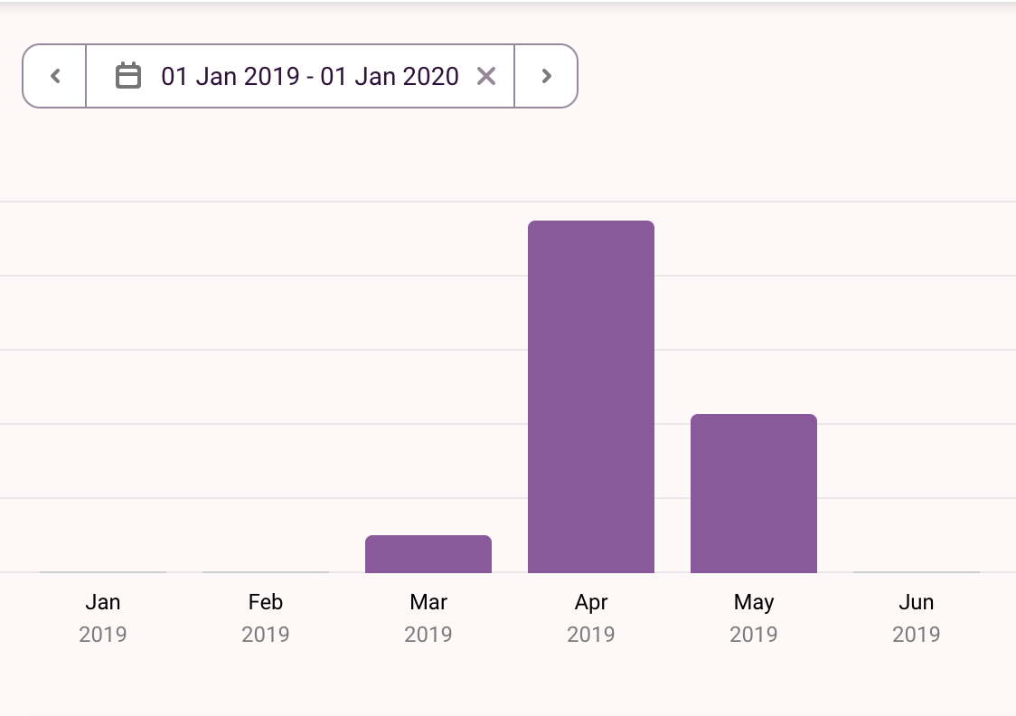
Does the Weather Affect my Productivity?

For most of us, the environment in which we work is an extremely impactful factor that contributes to our capacity for productivity. Lighting, odor, temperature, furniture — these are parameters of our environment we can tune to allow ourselves to work better.
But we can't control everything, that would be cheating. Weather conditions are an external factor that may or may not affect productivity: one study suggests worse weather is correlated with higher productivity.
This got me thinking — could I conduct a toy case-study on myself? Where would I get the data? Suddenly, I remembered in the months of study-leave leading up to my International Baccalaureate (IB) exams, I had tracked my time spent studying and doing homework using Toggl.

So I had 135 hours' worth of data over March, April, and May 2019 that could be downloaded as a .csv — not bad. Also, at the time, I was totally blind to what I would do with the data, meaning I possibly ducked data collection biases by being naïve! I wagered it wouldn't be too hard to find the weather data, and the rest of this blog post is what ensued.
Part 1 — Weather data: collection
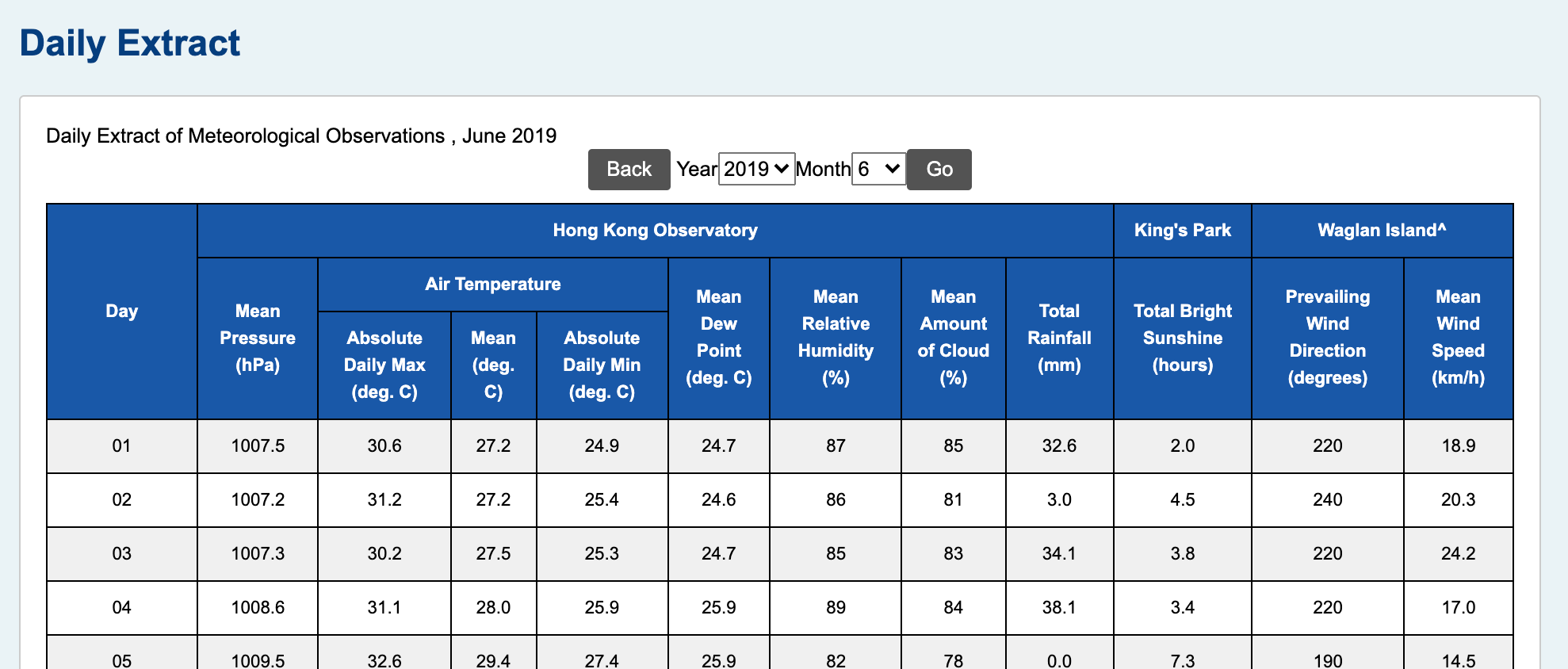
At the time of my IB exams, I was in Hong Kong, so I navigated to the Hong Kong Observatory to download the csv files, and was very quickly reality-checked when I realized the data I sought were nowhere to be found. Eventually I found a subpage that had daily extracts of records for my timeframe, but the problem was, the page looked like this:

And there was no 'Download' button in sight. In defeat, I copy-pasted 2019's records for March, April, May, and June (although June was not in the Toggl data) into a Jupyter notebook and prepared for some wrangling. With each month imported as a string, by some miracle, the text was delimited with tabs:
for line in mar.split('\n')[:5]: print(line)
We ideally want this in a pandas data frame or in .csv format, so we can begin by stripping any newlines and replacing the delimiter.
(mar, apr, may, jun) = (mon.strip('\n').replace('\t', ',') for mon in (mar, apr, may, jun))
Then, we can aggregate all months into one yearly string, and format the dates properly by joining 2019/0 with the month and date:
yearly = ""
for m, month_obj in enumerate((mar, apr, may, jun), start=3):
    yearly += f'2019/0{m}/' + month_obj.replace('\n', f'\n2019/0{m}/') + '\n'
The data also have some special characters indicating partial records, but we'll just strip those too, and add our headers. This gives the following:
yearly = yearly.rstrip('\n').replace('Trace', '0.0').replace('#', '') # remove trailing \n at end, markers
yearly = "date,mean_pressure,max_temp,mean_temp,min_temp,mean_dew,humid,cloud,rain,sunshine,wind_dir,wind_speed\n" + yearly
for line in yearly.split('\n')[:5]: print(line)
Now we can write this to a file and load it with pandas.
with open("hk_weather.csv", "w") as csv_file:
    print(yearly, file=csv_file)
hk_df = pd.read_csv('hk_weather.csv', header=0, index_col=False)
print(hk_df.shape)
Our last preprocessing job is to tell pandas our date column is of datetime format, and our job is done.
hk_df["date"] = pd.to_datetime(hk_df["date"])
hk_df.head()
Because I'm curious, let's check out how temperature and rain are distributed over the four months:
temps = alt.Chart(hk_df).mark_bar(tooltip=alt.TooltipContent('encoding')).encode(
    alt.X("mean_temp:Q", bin=True, title="Average Temperature (C)"),
    alt.Y("count()", title="Number of days"),
    color=alt.Color("month(date):O", title="Month", legend=alt.Legend(direction="horizontal", orient="top"))
).properties(width=250, height=200)

rains = alt.Chart(hk_df).mark_bar(tooltip=alt.TooltipContent('encoding')).encode(
    alt.X("rain:Q", bin=alt.Bin(extent=[0,120], step=10), title="Rainfall (mm)"),
    alt.Y("count()", title=None),
    color="month(date):O"
).properties(width=250, height=200)

temps | rains
This is not just an excuse to show off the sheer power of Altair (the chart is interactive, too), but we can see that there are not that many rainy days in our dataset. Either way, we've essentially got half of the data processing done.
Part 2 — Toggl data: quantifying productivity
I glossed over this in the introduction, but if we're going to approach the question "Does weather impact my productivity?" we're going to need to define 'productivity.' Before we tackle that, let's load the data from Toggl:
toggl = pd.read_csv('time_entries.csv', header=0)
toggl['Email'] = '-'
toggl.head()
Understanding the Toggl data
In Toggl, each entry requires a 'description' and a 'project' (originally designed for firms to track employee hours). Here, a 'description' in the data represents a specific task done, e.g. Physics Notes, and a 'project' represents what type of task that belongs to, e.g. Study / Revision. Toggl also records the date and time you started and ended the task, in addition to the duration.
The data frame is obviously quite bloated (and includes my email!), so let's subset the columns:
toggl = toggl.iloc[:, [3, 5, 7, 8, 11]]
toggl.head()
Defining productivity
So how can we quantify productivity? There would be many ways to do this, but my approach is simple: assume that productivity is directly proportional to the minutes of schoolwork logged (in some timeframe). This way, if I goofed off, I wouldn't have recorded any work, so Minutes would be 0. An extra benefit of totalling the minutes worked rather than the amount of tasks done in a day is that we don't interpret doing many small tasks as 'being more productive' than doing one large task (also, we lack sufficient data to count entries as units of productivity).
It may be argued this approach is counterintuitive given productivity is largely thought of alongside efficiency, and this approach may actually penalize efficiency by rewarding longer tasks (even if the effort is low). However, since our sample is quite small, my intuition says we can't reliably derive a measure like minutes worked per complete task, so we'll stick to the prior approach. As an aside, this is an example of an assumption and design decision made in the data science process that may fundamentally alter the results of an analysis.
With that out of the way, let's add a new row to our data frame called Minutes that is the total minutes worked for one entry. We can pass the string Duration to a function to convert the HH:MM:SS format to a numeric type:
def str_to_dt(in_string):
    timeq = [int(i) for i in in_string.split(":")]
    return timeq[0]*60 + timeq[1] + timeq[2]/60
toggl["Minutes"] = toggl["Duration"].map(str_to_dt)
The map() function here is essentially taking every record of Duration and passing it to str_to_dt() to compute the minutes worked. Let's take this opportunity to also correct some types, and we'll add a new column called Task_Start to store both the date and time of starting a time entry.
toggl["Task_Start"] = pd.to_datetime(toggl["Start date"] + " " + toggl["Start time"])
toggl["Start date"] = pd.to_datetime(toggl["Start date"])
toggl["Start time"] = pd.to_datetime(toggl["Start time"])
toggl.head()
Now we're ready to visualize the data. The two plots effortlessly made with Altair display how minutes are distributed in each project, and when each task was done. Click on a colored bar in the top plot to explore a project, and hover over points on the lower chart to see individual tasks. You can also try clicking and dragging on the lower plot to highlight a timeframe to see the minutes distribution update.
proj_select = alt.selection(type='interval', encodings=['x'])
hist_select = alt.selection_single(fields=["Project"])

hist_alt = alt.Chart(toggl).mark_bar(tooltip=alt.TooltipContent('encoding')).encode(
    alt.X("Minutes:Q", bin=alt.Bin(extent=[0,250], step=15), title="Minutes spent doing entry"),
    alt.Y("count()", title="Number of entries"),
    color="Project:N"
).properties(
    width=400
).add_selection(
    hist_select
).transform_filter(
    proj_select
).transform_filter(
    hist_select
)

line_alt = alt.Chart(toggl).mark_point(size=60).encode(
    alt.X("Start date:T", title="Date"),
    alt.Y("Minutes:Q", title="Minutes spent doing entry"),
    color=alt.condition(hist_select, 'Project:N', alt.value('lightgray')),
    opacity=alt.value(0.65),
    tooltip=alt.Tooltip('Description:N')
).add_selection(
    proj_select
).properties(
    width=400
)

hist_alt & line_alt
Unsurprisingly, homework and revision dominate the entries. The 'Entertainment' category is also quick to fade as exams begin to creep up (beginning on May 6 in 2019). There are also some hints my study habits were more sporadic towards the beginning of exams too, with entries becoming more densely distributed at shorter minute counts.
We can also inquire into the day specifics. The two charts below implicitly answer the questions "Which day was I most productive throughout the week?" and "At what time did I record the most tasks?"
w_chart = alt.Chart(toggl).mark_bar(tooltip=alt.TooltipContent('encoding')).encode(
    alt.X("day(Task_Start):T", title="Day of week"),
    alt.Y("count()", title="Number of entries"),
    color=alt.Color("Project:N", legend=alt.Legend(orient='top'))
).properties(
    width=250,
    height=200
)

h_chart = alt.Chart(toggl).mark_area(tooltip=alt.TooltipContent('encoding')).encode(
    alt.X("hours(Task_Start):T", title="Time of day"),
    alt.Y("count()", title=None),
    color='Project:N'
).properties(
    width=250,
    height=200
)

w_chart | h_chart
These charts show entertainment and homework taking over during weekends, and revision stagnating throughout the week (remember, I was on study-leave for these months).
Part 3 — Answering the question(s)
Let's move on to trying to answer the question at hand: "Does the weather affect my productivity?"
Rain analysis
First, I want to investigate whether rain makes me more prone to working hard. We're aiming for data with just productive entries, so let's drop all rows that aren't concerning 'Homework' or 'Study / Revision':
toggl = toggl[(toggl["Project"] == "Study / Revision") & (toggl["Project"] != "Homework")].reset_index(drop=True)
toggl.head()
Now let's take a look at our minutes data for 'productive' entries:
toggl["Minutes"].describe()
As an aside, can we investigate which subject/task took me the longest to complete work for, on average:
toggl.groupby('Description')['Minutes'].describe().sort_values('mean', ascending=False)
So English seems to be the most laborious with Mathematics past papers trailing. Economics also has the highest entry total of 72. I could aggregate these further into classes, but I digress.
At this point we should ask about the number of days we have:
toggl["Start date"].nunique()
39 is a pretty small sample size, but the analysis is still worth a shot anyways. Let's start by just grabbing the related rows of our weather data frame:
raindf = hk_df.iloc[:, [0, 8]]
raindf.head()
Then we can aggregate our Toggl data into two rows: days, and minutes worked for that day.
toggl_days = toggl.groupby('Start date')['Minutes'].sum().reset_index().rename(columns={"Start date": "date", "Minutes": "minutes"})
This operation isn't too intimidating — in English, this is telling pandas to compute the sum of minutes worked for each day, and .reset_index() fixes our indices (left-most bolded column), and we finish by renaming the columns.
toggl_days.head()
A nice result. We can now seamlessly join these tables and write them to a .csv:
df = pd.merge(toggl_days, raindf)
df.head()
df.to_csv("rain_raw.csv", index=False)
To gauge whether rain has an effect on minutes worked, we want to be able to classify each day as either 'rainy' or 'not rainy'. One method for classifying days based on precipitation is to use a threshold $\boldsymbol{\lambda} \in \{0.1,0.2,1,10,25\}$ such that:
$$ \verb|rain| = \begin{cases} \text{False} \quad &\text{if} \, \verb|rain| \lt \lambda \\ \text{True} \quad &\text{if} \, \verb|rain| \ge \lambda \\ \end{cases} $$To choose $\lambda$, let's check out our data for rain:
df['rain'].describe()
alt.Chart(df).mark_bar().encode(
    alt.X("rain:Q", bin=alt.Bin(extent=[0,80], step=5)),
    alt.Y("count()")
)
Given Hong Kong's humid nature alongside the median precipitation, $\lambda=1\,\text{mm}$ appears to be a good fit for the data. We can redefine our rain column to achieve the following data frame:
df.loc[df['rain'] >= 1, 'rain_day'] = "Yes"
df.loc[df['rain'] < 1, 'rain_day'] = "No"

df.drop(columns='rain', inplace=True)
df.rename(columns={"rain_day": "rain"}, inplace=True)
df.head()
Let's see how the data are split:
df['rain'].value_counts()
Which is as good of a split as we could've hoped for. Now for some preliminary visualization: let's see how rainy/non-rainy days are distributed against minutes:
alt.Chart(df).mark_bar(tooltip=alt.TooltipContent("encoding")).encode(
    alt.X("minutes:Q", bin=alt.Bin(extent=[25,500], step=25), title="Minutes spent on schoolwork"),
    alt.Y("count()", title="Number of entries"),
    alt.Color("rain:N", title="Rain",
              scale=alt.Scale(domain=["No", "Yes"], range=['#ffdfbf', 'steelblue']))
)
By eye, it looks like rainy days have slightly higher minute counts. Let's compute the mean of both types of days:
df.groupby('rain')['minutes'].mean()
So the average task time is higher on average, but is the difference statistically significant? One way of answering this is to knock on classical statistics' door and ask for a p-value. We want to test the alternative hypothesis that rainy days, on average, have higher minute counts. So our null hypothesis will be that there is no difference between minutes worked on average on rainy and non-rainy days. So our set-up is as follows:
$$ H_0:\mu_R=\mu_N \\ \text{vs} \\ H_A:\mu_R\gt\mu_N$$where $\mu_R,\mu_N$ are the true means of minutes worked for rainy and non-rainy days respectively. Let's write the data frame to a .csv and head into R to perform a simple t-test:
df.to_csv("rain_school.csv", index=False)
rain <- read.csv("rain_school.csv")
t.test(rain[rain$rain=="Yes",]$minutes, rain[rain$rain=="No",]$minutes, alternative='greater')
    Welch Two Sample t-test

data:  rain[rain$rain == "Yes", ]$minutes and rain[rain$rain == "No", ]$minutes
t = 0.48793, df = 35.485, p-value = 0.3143
alternative hypothesis: true difference in means is greater than 0
95 percent confidence interval:
 -40.11065       Inf
sample estimates:
mean of x mean of y
 216.9430  200.6475
So we obtain a p-value of $\approx0.3$, which is quite large. To interpret this, we can say that if we repeated the experiment for minutes worked on rainy/non-rainy days, and there really was no impact of rain on minutes worked, the probability of seeing more minutes worked for rainy days than non-rainy days to the extent we saw or to a greater extent just by chance is 30%.
While that is a mouthful, it tells us there is a relatively high probability of seeing a positive deviation in minutes worked just by chance if there was no difference in rainy/non-rainy days — so we fail to reject the null hypothesis. The mini-conclusion here is that more data are definitely needed.
Predicting minutes worked
Let's backtrack and look at the rest of the weather data:
hk_df.head()
There are an abundance of variables — let's just choose mean_temp, humid, cloud, rain, and sunshine as factors we think may have an impact on productivity.
weather = hk_df.iloc[:, [0, 3, 6, 7, 8, 9]]
weather.head()
Let's join this with our previous table containing the minutes, and write that to a .csv:
df = pd.merge(df.iloc[: , [0, 1]], weather)
df.to_csv("full_days.csv", index=False)
df.head()
If you were wondering, sunshine is the number of hours of bright sunshine hours, not total. Let's head over to R to try to build some models for predicting minutes. We can begin by just checking out the correlations between our variables:
> days <- read.csv("full_days.csv")
> cor(days[c(2:7)])
            minutes   mean_temp      humid       cloud        rain    sunshine
minutes    1.00000000  0.08525068  0.1479811 -0.07462029 -0.04984429  0.07714833
mean_temp  0.08525068  1.00000000 -0.3882086 -0.63293077 -0.23396924  0.70265663
humid      0.14798108 -0.38820860  1.0000000  0.56440892  0.53635898 -0.63297290
cloud     -0.07462029 -0.63293077  0.5644089  1.00000000  0.33323933 -0.90797842
rain      -0.04984429 -0.23396924  0.5363590  0.33323933  1.00000000 -0.38933099
sunshine   0.07714833  0.70265663 -0.6329729 -0.90797842 -0.38933099  1.00000000
We can see the weather associations we'd expect — temperature/cloud and sunshine, humidity and cloud, etc. But the correlations among minutes look pretty unpromising. Regardless, let's begin by partitioning our data with a 75/25 training/testing split:
set.seed(30734592) # for reproduceability
train.ind <- sample(seq_len(nrow(days)), size = floor(.75*nrow(days)))
days.train <- days[train.ind,]
days.test <- days[-train.ind,]
And fit a multiple regression equation by modeling minutes as a function of our weather variables:
> days.fit <- lm(minutes ~ mean_temp + humid + cloud + rain + sunshine, data=days.train)
> summary(days.fit)

Residuals:
    Min       1Q   Median       3Q      Max
-117.588  -65.600   -2.683   69.162  151.200

Coefficients:
            Estimate Std. Error t value Pr(>|t|)
(Intercept) -139.4934   413.7243  -0.337    0.739
mean_temp    -13.0997     9.7955  -1.337    0.194
humid          7.0194     4.1107   1.708    0.101
cloud          0.2519     2.0980   0.120    0.905
rain          -1.7436     1.2900  -1.352    0.190
sunshine      10.9424    14.1435   0.774    0.447

Residual standard error: 86.59 on 23 degrees of freedom
Multiple R-squared:  0.1723,    Adjusted R-squared:  -0.007695
F-statistic: 0.9572 on 5 and 23 DF,  p-value: 0.4639
Our p-values are pretty large across the board, but there are some hints a few variables may be associated with minutes. We can calculate the Root Mean Square Error (RMSE) by
where $ y_i $ are the true values for our targets, and $\hat{y}_i$ are the predicted values, and $n$ is our sample size. This can be done in R for our test dataset:
> sqrt(mean((days.test$minutes - predict(days.fit, days.test))^2))
[1] 160.763
Which is quite a large average difference. We can try a few other models — bagged regression trees are generally good for reducing variance. We can create one in R with the rpart package:
rain_bag <- bagging(
    formula = minutes ~ mean_temp + humid + cloud + rain + sunshine,
    data = days.train,
    nbagg = 100,
    coob = TRUE,
    control = rpart.control(minsplit=2, cp=0)
)
> sqrt(mean((days.test$minutes - predict(rain_bag, days.test))^2))
[1] 154.6983
And we achieve a new RMSE of 155, which is a slight improvement over 161. We can try one more model — a random forest, for fun. We can use the randomForest library in R to elegantly do this:
rain.rf <- randomForest(minutes ~ mean_temp + humid + cloud + rain + sunshine,
                        data=days.train,
                        importance=TRUE)
> sqrt(mean((days.test$minutes - predict(rain.rf, days.test))^2))
[1] 149.7549
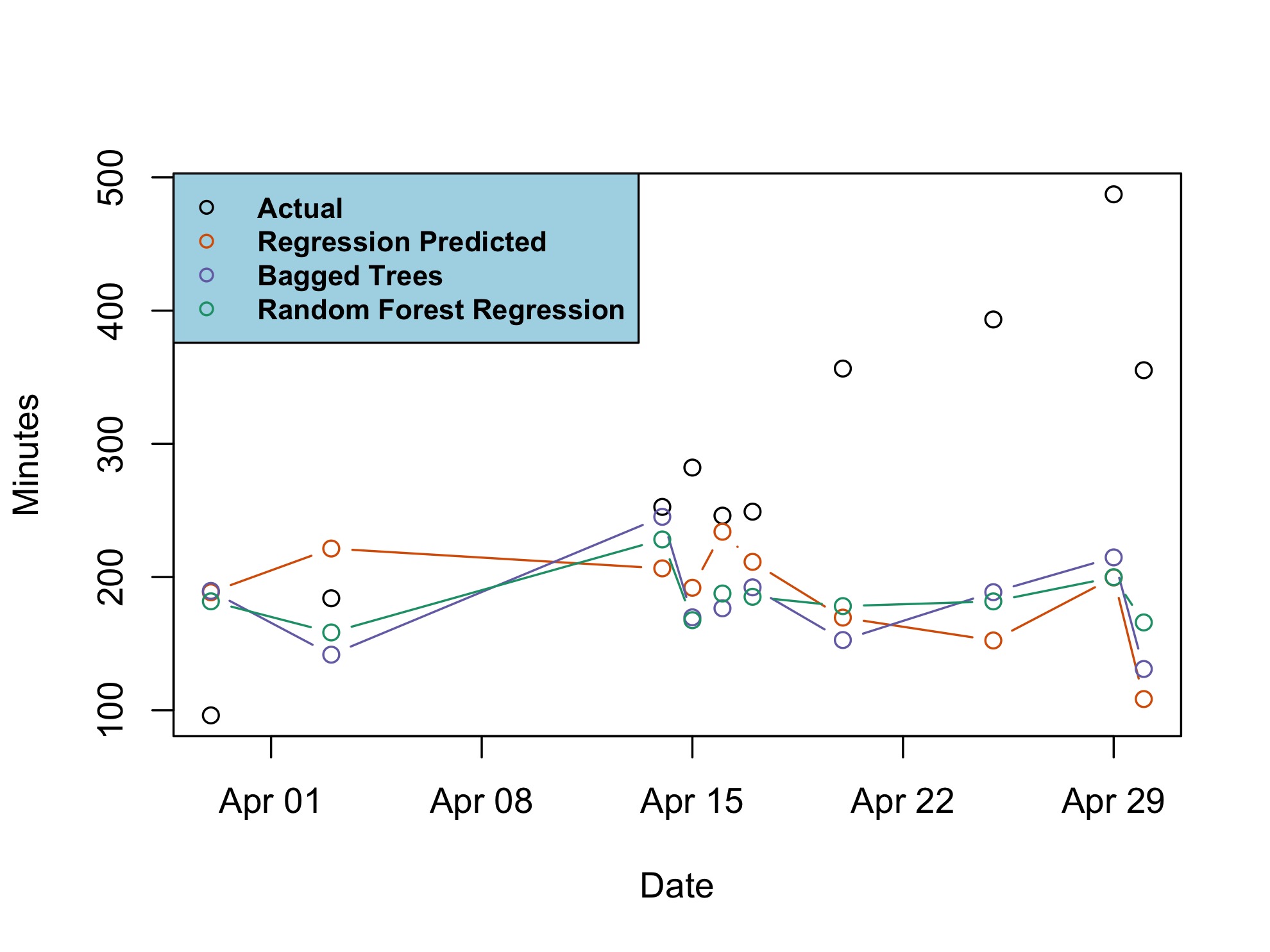
And an RMSE of 150 is again an improvement over 155 and 161, but is still very high. To conclude, we can plot the predictions and compare models:

Conclusion
As is typical with analysis of small samples, more data are needed to conclusively suggest there is any difference in (my) productivity owing to the weather. Looking back at the linear model, perhaps an interesting route to explore is humidity due to its notable t-statistic and seemingly borderline association ( $p\approx0.1$). Of course, this may very well be solely due to chance (the more low-quality features we include, the more likely we find a non-existent correlation due to chance).
At the very least, I'm happy I had the opportunity to poke around in some of my old data and refresh my pandas/R/Altair skils, and conduct some surface-level exploratory analysis even if the results were inconclusive. As is sometimes the case with throwaway personal projects, the famous saying can be invoked — it's about the journey, not the destination.